Klaviyo e-mail design


Overview
This article helps you with the basics of creating great emails. Before you proceed, you should have a good idea of the basic branding for your emails. Check the list below. If you are missing any of the following items, first go to the corresponding article.
No time to read the guide? We’ve created a checklist gemaakt to ensure your emails are ready to go. You can make a copy for yourself by going to File > Make a Copy and saving it in your own account.
Content Strategy
Before sending out any email, take a moment to evaluate your strategy. Every piece of communication with customers should have each of the following characteristics:
- A purpose - Why are you sending the email?
- An audience - Who are you sending the email to?
- A goal - What is your point?
The purpose of your email determines what kind of email you are sending. Are you launching a new product or sending an abandoned cart email? Each email will have different content, and it’s good to plan in advance what the purpose of the email is.
The audience informs your email. Who gets what information? Weekly newsletters go to people who opted to receive that communication from you, but a sales email can simply go to your bargain hunters. Similarly, if you have a physical event, you can select people and send an email about that event instead of emailing your entire list.
Each of your emails should have a goal in mind. Do you want someone to read a blog post or purchase a new product? Whatever the goal is, the button to the link or the call-to-action (CTA) should be large and easy to find.
Need more help developing your content? Check out this article on creating a contentkalender.
Email Basics
Before sending your very first email, add your branding through the Setup Wizard, so that the pre-built email templates in Klaviyo are customized for you, saving you time. To go through the wizard, go to the Account Dropdown and select the Setup Wizard.
The overall design of your emails should be simple and clear. Keep your background images subtle, your width at 600px, and ensure you have one main CTA and goal for your email.
Additionally, you should add default values if you use personalization and also test new ideas through A/B testing.
If you want to implement one of the ideas mentioned in this video, check out the following articles:
Message Overview
First and foremost, ensure that your from/reply-to address is from your business address to ensure that your emails are delivered to the inbox.
Keep the information in the subject line and preview text on-topic and to the point. Avoid spammy-sounding words and text, and use emojis only if they enhance your message.
If you want to execute one of the ideas mentioned in this video, check out the following articles:
Header/Link Bar
In your header/link block, keep your logo around 200px and ensure there are only three to four links that align with your navigation. Feel free to omit navigation links in your header if you think it detracts from the overall look of your email.
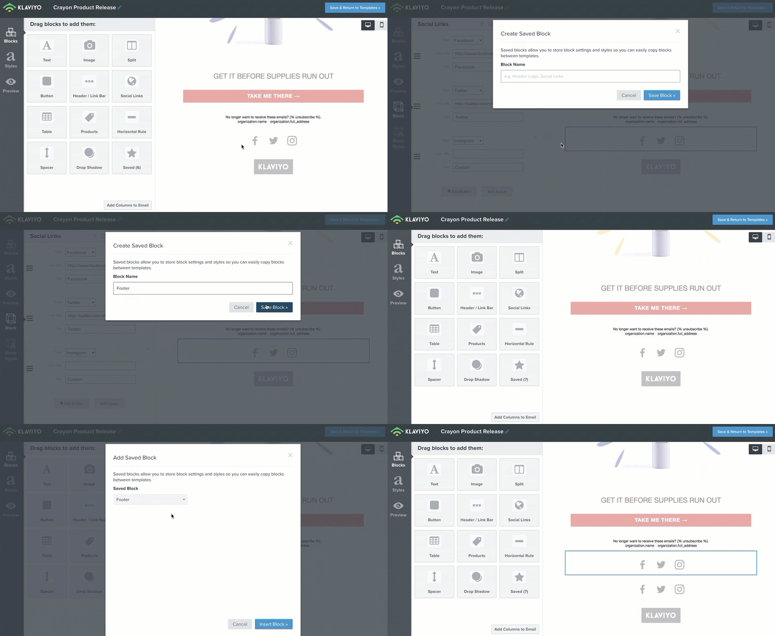
Saving your header is also a great way to speed up the time it takes to design your emails. To do this, click on your header, then click the star icon, give the block a name, and select Save Block. To use this in a later email, simply drag a saved block in and select your header from the dropdown.

If you want to implement one of the ideas mentioned in this video, check out the following articles:
Body Content
Your body content is where you have the most freedom in your emails. Use high-resolution images, minimal text, and one main CTA.
If you want to implement one of the ideas mentioned in this video, check out the following articles:
Social Media and Footer
Last but not least is the footer of your email. Here, you want to include only relevant links to social media that align with the rest of your email. Additionally, you are legally required to include an easy-to-use unsubscribe link, as well as information about your company. Check your preferences pages to ensure that your unsubscribe and preference management pages are well-branded and ready for use.
Like with your header, saving your footer is a great way to speed up the time it takes to design your emails. To do this, click on your footer, then click the star icon, give the block a name, and click Save Block. To use this in a later email, simply drag a saved block in and select the footer from the dropdown.

If you want to implement one of the ideas mentioned in this video, check out the following articles:
- Social Links
- Adding an Unsubscribe Link to Campaigns
- Creating a Custom Unsubscribe or Manage Preferences Page
- Customize the Unsubscribe Page of a List
Elevate Your Email Design
If your standard email design is good and you want something to enhance it or try something new, check out the ideas below and consider implementing one for your next send.
Aangepaste lettertypen
Custom FontsIf you want to add a custom font to your emails that isn’t available in Klaviyo, use, this article, on adding custom fonts to your email templates.
Show/Hide Blocks
If you want to show or hide a particular block based on a property about someone, a profile property, or an event, go to this article, on displaying/hiding template blocks based on dynamic variables.
Button to Collect Data
Want to gather information about your subscribers through an email? Check out this article on using buttons in an email to collect information about your recipients
Countdown Timers
Using a timer in an email is a great way to build urgency and keep your customers informed. Read this guide on adding a countdown timer to your email template.
Checklist
Do you think your email is well designed and ready to go? Check this checklist to ensure you’ve incorporated all the tips from this guide.
%20(1).png)


